
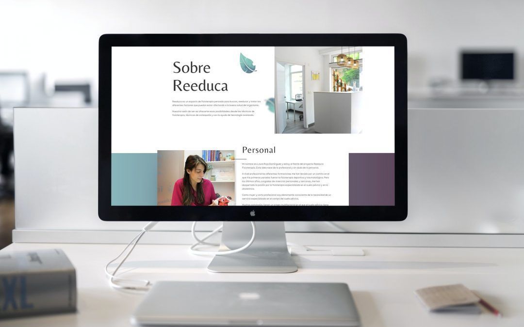
We recently published the corporate website of Reeduca Fisioterapiaa clinic specialising in pelvic floor re-education located in Barakaldo (Bizkaia). As a result of all the work carried out, we detected certain fundamental aspects to take into account when creating a physiotherapy website.
When we talk about working on the website of a newly created establishment, there are many decisions that must be taken and assessed carefully, as we are building the first visual impact that the potential client will have on our clinic when browsing the internet. All of this is even more relevant if we are talking about the health sector, from which a certain seriousness and professionalism is expected.
What decisions do I have to make before I start working on the physiotherapy services website?
It is essential to decide on certain styles of communication that will define the personality of your clinic and your work. Of course, it is important that these styles are consistent across all dissemination media (social media, printed brochures, web, etc.). Some examples that should not be overlooked are:
- Values. To carry out the first briefing, I always like to ask what 3 or 4 differentiating values the client sees in their company, in order to keep them in mind when making design decisions. In the case of Reeduca, we opted for "high specialisation", "integrated approach: physical and educational" and "close and personalised treatment". Thus, all the elements and styles that are defined must be aligned with these values. For example, if we choose "close treatment", it would make no sense to write from a distant and depersonalised point of view.
- Tone. In what tone will you approach your texts? We can write with a "you" or a "you", although the latter is increasingly out of use. The same is true when we talk about we or I, in the case of a sole proprietorship? What level of technicality am I going to adopt on my website? The more clearly we define these nuances, the less difficult it will be to approach our target audience.
- Corporate identity. As I always repeat, before starting with a website, it is advisable to have worked on the corporate identity and well selected our colours, logotype and typographies.

A good architecture, essential for a physiotherapy website
One of the things we detect in the physiotherapy sector is that the majority of corporate websites are guilty of large and complex content trees that can confuse the user. It is well known that these clinics offer a lot of services and programmes, so sometimes it is difficult to structure all these options in a clear and simple way and we end up creating a page for each service offered.
This, from my point of view, is a major communication error and affects the basis on which a good website is based: simplicity and ease of navigation. It is always advisable to reduce the number of pages as much as possible so that our services are well categorised and ordered in the user's mind like watertight boxes in the shortest possible time.
For example, in the case of Reeduca Physiotherapy, we chose to classify the services in this way:
- Treatments:
- Pelvic Floor Unit
- Comprehensive physiotherapy
- Treatment of infants - Classes and workshops
- Full programmes

Thus, we see three main categories of service that are sufficient for our potential visitor to make up his mind. first idea of what we offer and in which areas, and then you can discover all the services on each of the lower pages. If there is a sub-service that we want to emphasise and that we think is not visible enough (e.g. obstetric physiotherapy), we can always include an call to action o shortcut on the clinic's homepage to take our user there.
In my opinion, creating more than 4 or 5 main service categories is excessive for a website of this type. It is a good idea to work on this scheme before setting up the website.
Less is more
This is another idea that I keep repeating like a parrot to everyone who works on a website: let's get away from the large masses of text. On the web, we hardly read, we scan with our eyes. In a Nielsen Norman Group study which is a few years old but still fully valid, it was established that we barely reach 30% of reading the content on a web page.
It is normal that if we are physiotherapists we want to demonstrate our professionalism and our knowledge through the texts in order to differentiate ourselves from the competition, but the target audience of a physiotherapy service will rarely want to read technical or lengthy texts. Rather, they want to take a look to see if what we offer matches their needs, where we are and if the overall look of the website looks professional.
Of course, the texts must be carefully written, avoiding mistakes and maintaining consistency, but it is possible to to say the essentials with a good design and we already have the curiosity installed in the reader. After all, we want them to contact us for more information, to take them from the online to the offline channel.
People want photos
It is increasingly obvious that audiovisual material is overtaking written text in relevance when it comes to any kind of corporate website.
In the case of a physiotherapy clinic, it is essential to have a good image gallery of the establishment that we can include in grid or slider mode. On the Reeduca website, we decided to include a slider (or slideshow) as soon as you enter the "About Reeduca" page. This brings a certain dynamism and interactivity to a corporate website that is usually quite static.
In addition, potential customers want to see faces, faces of the people who are going to serve them, so it is highly recommended that you include photos of the team.

We do all this for you (and more)
So far we have compiled some essential factors that are important to consider when building a good physiotherapy website. Don't forget, if you want to give your brand a quality online image, I can help you achieve it. Request your free assessment session.